 2026 -


Maison Series
Manhattan Manor
New York Edition
Series Overview
Design Intent
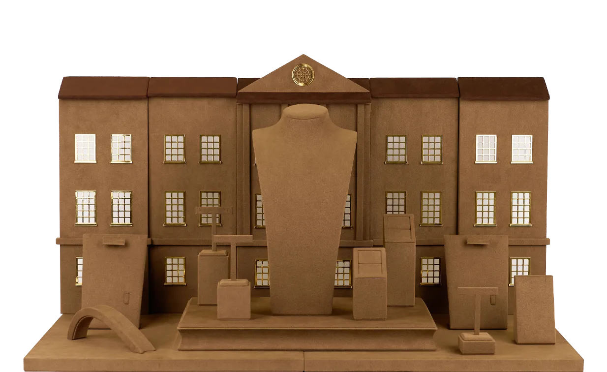
Manhattan Manor – New York Edition is conceived as a spatial interpretation of East Coast architectural order, where symmetry, proportion, and restraint define a language of clarity, authority, and permanence.
Rooted in the classical and institutional architecture of New York, the design draws from axial planning, balanced facades, and disciplined geometries—elements that historically express stability, power, and cultural continuity. These principles are translated into a structured display system where space is organized with precision and intent.
The composition is governed by a central axis, establishing a clear hierarchy and visual focus. Symmetry is used not only as a formal device, but as a tool to reinforce balance and control. Ornamentation is minimized, allowing proportion, alignment, and material contrast to define the spatial identity.
Materials are selected to emphasize refinement and discipline—neutral tones create a calm visual field, while metallic accents introduce precision and subtle brilliance. Light is carefully directed to enhance clarity, ensuring that jewelry stands out with sharp definition rather than dramatic contrast.
Within this framework, jewelry is presented with confidence and composure. The system transforms architectural order into a repeatable spatial logic, enabling a consistent and elevated brand presence across contemporary retail environments.
Culture
Manhattan Manor – New York Edition is rooted in the architectural heritage of America’s East Coast—a spatial tradition defined by symmetry, proportion, and a sense of permanence shaped over time. This cultural foundation not only defines the urban landscape, but also embodies values of rationality, restraint, and refined sophistication.
Among its references, landmark buildings such as Old Queens exemplify this enduring spatial spirit, serving as a key cultural anchor for the series.
Language
Manhattan Manor – New York Edition translates this cultural foundation into a clear and recognizable spatial language. Through symmetrical structures, framed compositions, and well-defined hierarchies, it establishes a visual order that is both stable and rhythmic. A restrained yet expressive color palette, combined with precise geometric articulation, reinforces the presence and control of the space.
Within this language, space is no longer a passive background, but a structured stage — where jewelry is presented with clarity, confidence, and deliberate control, creating a consistently recognizable brand impression.
System
Built upon the FPA system, the series integrates modular structures, standardized materials, and controlled craftsmanship into a unified framework. Through predefined component logic and material standards, it enables rapid assembly and consistent presentation across different environments. While maintaining visual coherence, the system also offers flexibility, scalability, and cross-market adaptability.
More than a method of execution, this system ensures that brand spaces can be consistently replicated and sustainably maintained—forming a stable foundation for global brand expression.